Leopard Gold rug
Leopard is a neutral. A neutral that’s super versatile and pairs well with everything from deep colours and florals to black and subtle pinks. It also happens to bring a hint of the wild and nature to your home, which is never a bad thing.
Yes, it’s a pattern that splits opinion, yet sometimes it’s just about knowing how to place it in a room that can make all the difference. Did you know, for instance, that leopard looks effortless alongside soft pinks? Let’s explore…
Perfect with pink
Delicately feminine, a soft pastel pink on the walls can make the ideal setting for adding leopard print décor. Pink is also a neutral and doesn’t compete too much as well as adding some warmth. Some colours can look a bit flat or drab, pink isn’t one of them. You’ll notice that it’s a favoured colour in many interior stylists’ homes as it goes with a multitude of patterns without sapping the light from a room.
Just notice how calming and romantic pink looks on Wendy’s walls here:

Soft pink colours tone with the Leopard Palms Light rug
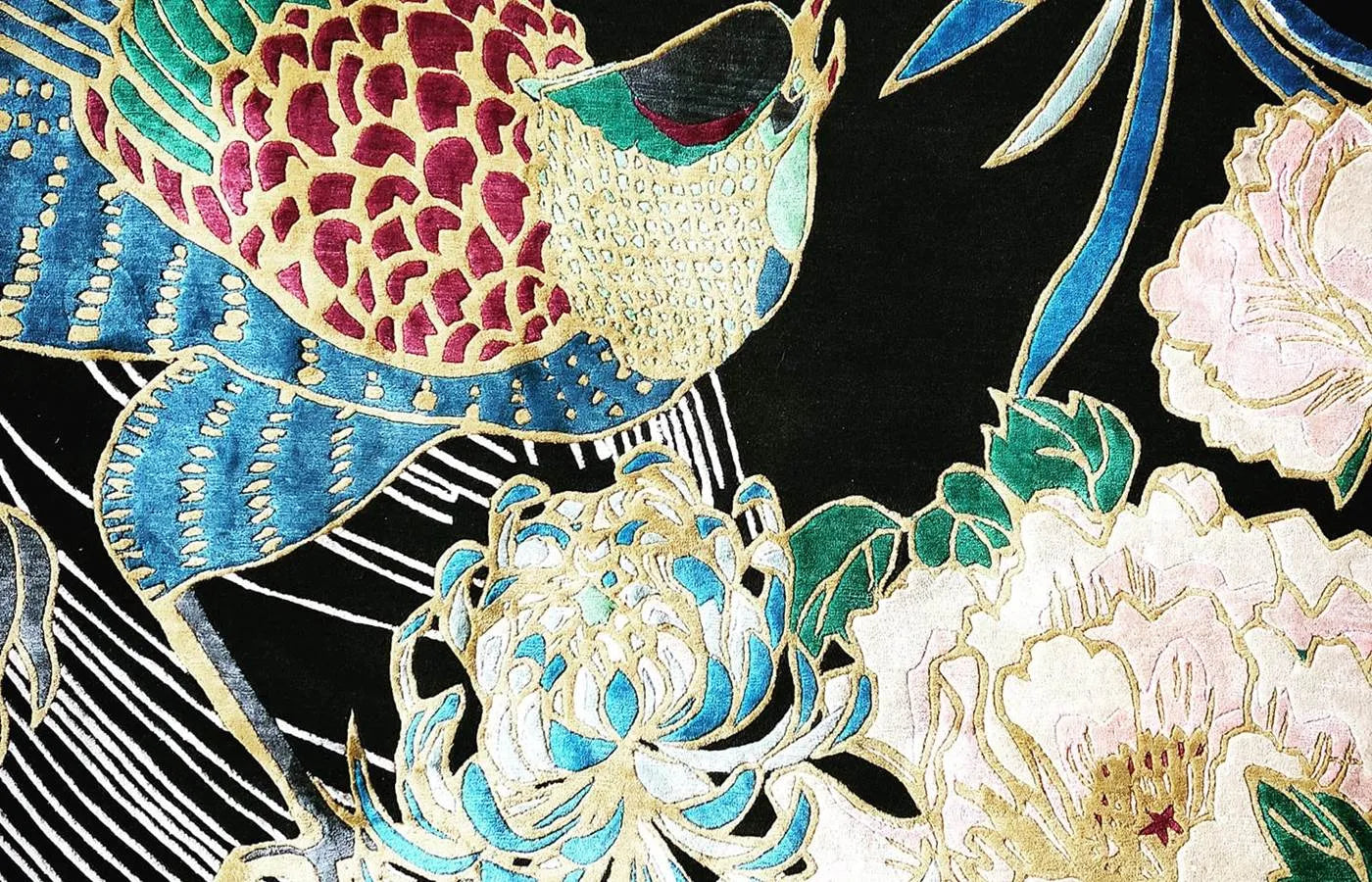
Darker pinks and reds also complement natural leopard colours really well. Here’s one for your wish list – Leopard Florals features pretty orchid and chrysanthemum details to its border:

Keep the natural leopard tones
The tawny shades of traditional leopard spots are the right side of sophisticated. While fashion always seeks to stretch the boundaries, we would say an electric blue leopard print is best left on the clothes rail. As much as we love unusual colour mixes and patterns, sometimes it’s best not to mess with the originals too much. After all, leopard print designs have evolved from nature, a masterpiece in itself that’s best left untouched.
That’s why many of our leopard rugs stay closer to natural or pale tones. Leopard Gold, for example, is a subtle beauty, sporting the glamourous lustre of sustainable Tencel with a wool base. It’s a leopard rug that works just as well in traditional and modern homes:

Leopard Gold rug details are made from sustainable Tencel
Into the deep with block colours
One of those well-known interior tricks, of course, is to contrast a pattern like leopard against a deep block colour. Think rich teal velvet sofas, jewel-like and opulent purples, or moody blacks to create instant glamour alongside your leopard rug. By going plain with furniture, you can be much bolder with your colour choices while still working leopard into your scheme. The leopard rug acts as a grounding neutral here:

Leopard Gold contrasts beautifully with a teal sofa
Elevate light schemes with a leopard rug
Get the balance right
If you haven’t already noticed, we’re rather a fan of maximalism and very much on team leopard. However, even in a maximalist scheme, it’s all about finding the right balance when placing your leopard rug. Take a look at the bedroom rug styling below. It remains balanced because the tones, patterns and colours of the Leopard Palms Light rug are picked up by other items in the room – with the feather pink light shade, nature-inspired prints, the bedside table, and even the pink and blue floral chairs. Then for the contrast. The rich teal colour on the walls adds depth to the room and the dramatic carved bed frame looks right at home.

Leopard Palms Light rug is a good grounding for a maximalist bedroom
Leopard rugs can accent a room with an exotic touch without being overpowering. Think of leopard as a great supporting player to the rest of your room scheme. In fact, in the fashion world at least, most zoologically-inspired patterns are now thought of as neutrals, including zebra, leopard and tiger. We don’t disagree. They can instantly ground a space while providing enough interest to add a little glam. Enjoy experimenting with wild neutrals.